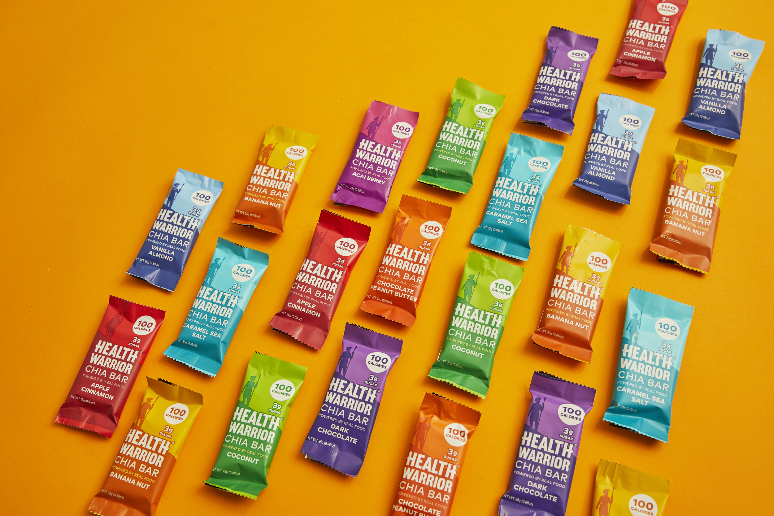
Health Warrior Branding
Major initiatives:
1. Elevate the visuals of homepage and blog pages.
2. Find solutions for better user experience.
3. Find a solution to set up visual hierarchies.
Health Warrior aims to champion all health warriors. Their mission is to fuel the world’s health momentum with delicious, seed-forward foods, as seeds are their #1 ingredient.
The main task was to find creative solutions to elevate the look of graphics and visuals on the site and streamline UX or navigation of Health Warrior’s current blog layout. I created the site design with super simple & clean shapes, yet the imagery is very colorful and fun. I also set up the visual hirachy to make the content easy to read and navigate.
Photography Mood Board
Recommendations for photography and art direction


User Flow
Homepage
Hierarchy: Same as visuals, it would be ideal to revisit what content to highlight based on market research and customer behavior. The “New to Health Warrior” banner can be close to the top of page to give it better visibility to users.
Product information: Previously, information about bundle offers is hidden. Customers need to click “Shop” to see variety packs (value packs) and it’s not even mentioned on the homepage.
Shopping options on the Homepage: Buying options are available on the homepage rather than on the shop page. It is a better way to simplify the buying experience.
Blog
Package Design
Chia Bar Pouch
Packaging design for Costco whole sale display
Pumpkin Seed Protein Bar
Packaging design for Costco whole sale display
Product Color Variation
Chia Bars: Chocolate Chip Cookie Dough
Packaging design for new flavor launch


